How Each Festival Identity Begins
- Nov 28, 2025
- 3 min read
(Spoiler: not with AI, but with pencils, paper, and conversation.)
Since 2002, we’ve been shaping a new visual identity for the festival every single year. More than two decades later, the work is still rooted in the same principles: curiosity, craft, and a deep respect for the story each festival wants to tell.
One of the reasons this long collaboration with the National Centre for Early Music (NCEM) works so well is trust. Under Delma Tomlin’s leadership, they’ve given us the rare luxury of time — time to listen, to sketch, to experiment, and to create imagery that lingers long after the final note fades.
The concept for the 2024 festival surfaced quickly. With transition at its core — shifts in thought, changing environments, and humanity’s ability to adapt — the theme naturally led us to Metamorfosi. The word itself inspired ideas of movement, light, and transformation.
Working closely with Delma, who already had a strong sense of direction, we began where we always begin: rapid scamps. Fast sketches. Scribbles. Rough shapes that allow ideas to spill out unedited. This stage is always messy, always lively, and always human. It’s where the spark happens.
Developing and Refining the Design

Typography plays a huge role in every festival identity. For Metamorfosi, we chose Gurmukhi, a contemporary semi-sans font that complemented the existing brand typefaces. It balances clarity and personality — ideal for a festival rooted in history but always pushing into new territory.
We then explored how the letters of Metamorfosi could appear as though emerging from darkness, like light slipping beneath a curtain. Theatrical. Mysterious. A visual metaphor for change.
Rather than letting software generate variations, we deconstructed the forms ourselves — deciding what to remove, what to emphasise, and how to keep the sense of transformation alive.
Prototyping Transformation
(Paper, tape, parcel tubes — and a camera.)


To interpret transformation in a more abstract way, we built physical prototypes. We wrapped parcel tubes with cut-out shapes, photographed them from different angles, and then refined what we captured in Photoshop.
The result was a dynamic backdrop full of flow and energy — something no prompt or AI suggestion could have produced, because it came from real-world play and discovery.
When all of these elements came together, the visual identity clicked into place. From brochures and banners to animations, social media graphics, and the website, the sense of metamorphosis ran through every touchpoint.
Looking Back: A Few Festival Highlights


Take a more detailed look at each festival here
Each year has taken us in a completely different direction:
2005 – Role of Women in Early Music
A portrait of Henrietta Maria formed an elegant identity across printed and displayed materials.
2010 – Musical Marriages
Celebrating creative partnerships across eras, the visuals were warm, celebratory, and layered through print and signage.
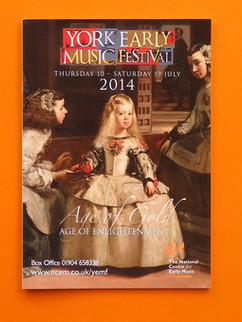
2014 – Age of Gold, Age of Enlightenment
A visual nod to Baroque and Classical opulence, applied across digital and print assets.
2015 – Entente Cordiale
Exploring the musical connection between Britain and France, with a design supporting major ensembles such as the Huelgas Ensemble and the Early Opera Company.
2023 – Smoke & Mirrors
An atmospheric interpretation of Tudor England, rolled out across print, web, and environmental branding.
2024 – Metamorfosi
Flowing forms and layered textures representing transformation and reinvention.
2025 – Heaven and Hell
An ambitious visual theme capturing ascent and fall, brought to life through brochures, signage, lamppost banners, and digital media.
Why We Still Create by Hand
(And why festival branding deserves it.)
Festival branding is far more than a visual wrapper. When it’s done well, it becomes part of the experience itself. People don’t just attend an event — they recognise it, connect with it, and remember it.
For us, the work is always about storytelling. Every identity is a gateway, a hint of the journey ahead. And that sense of narrative doesn’t come from templates or automation. It comes from sketchbooks, conversations, prototypes, drafts, reworks, and human intuition.
When a design feels authentic, audiences feel it too.
They come back. They share it. They make it part of their own story.
Thinking About Your Festival?
If you’re running a festival or venue and wondering how to create an identity that truly resonates, the York Early Music Festival offers a clear lesson:
Start with the story.
Trust the creative process.
Let the visuals add to the magic rather than simply decorate it.
Because when branding is based on real craft, collaboration, and curiosity — not shortcuts — it becomes unforgettable.


